Banding in solid colors: calibration before pass blending
Banding and gaps are especially easy to spot in solid blues and cyans. They can also show up in pink, purple or orange. The printer is running, yet the color still looks uneven.
In my tests, the issue came down to alignment: how the heads are positioned, where the drops land and how accurately the film moves between passes. Several small errors add up to a visible defect in a solid fill.
Why “almost aligned” is not enough
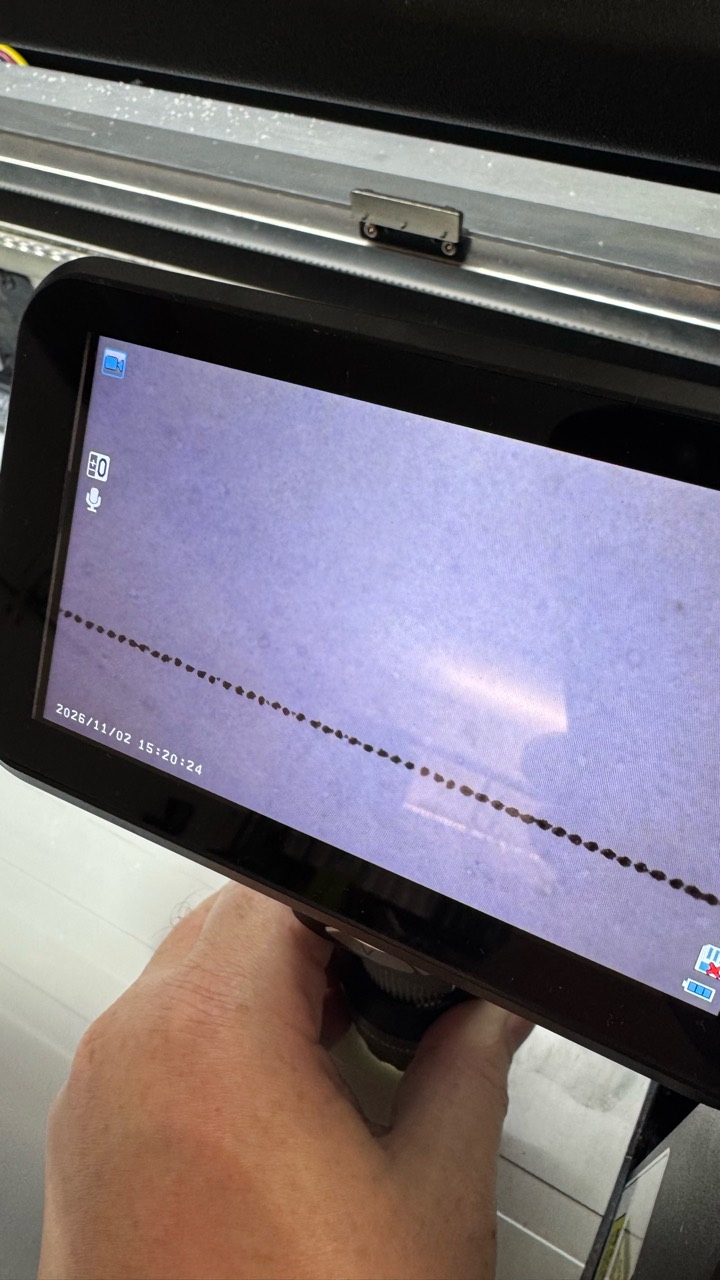
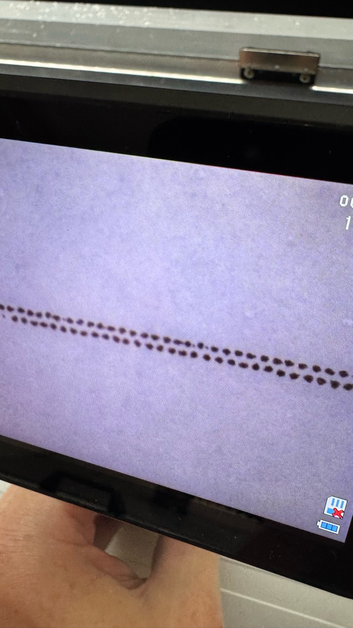
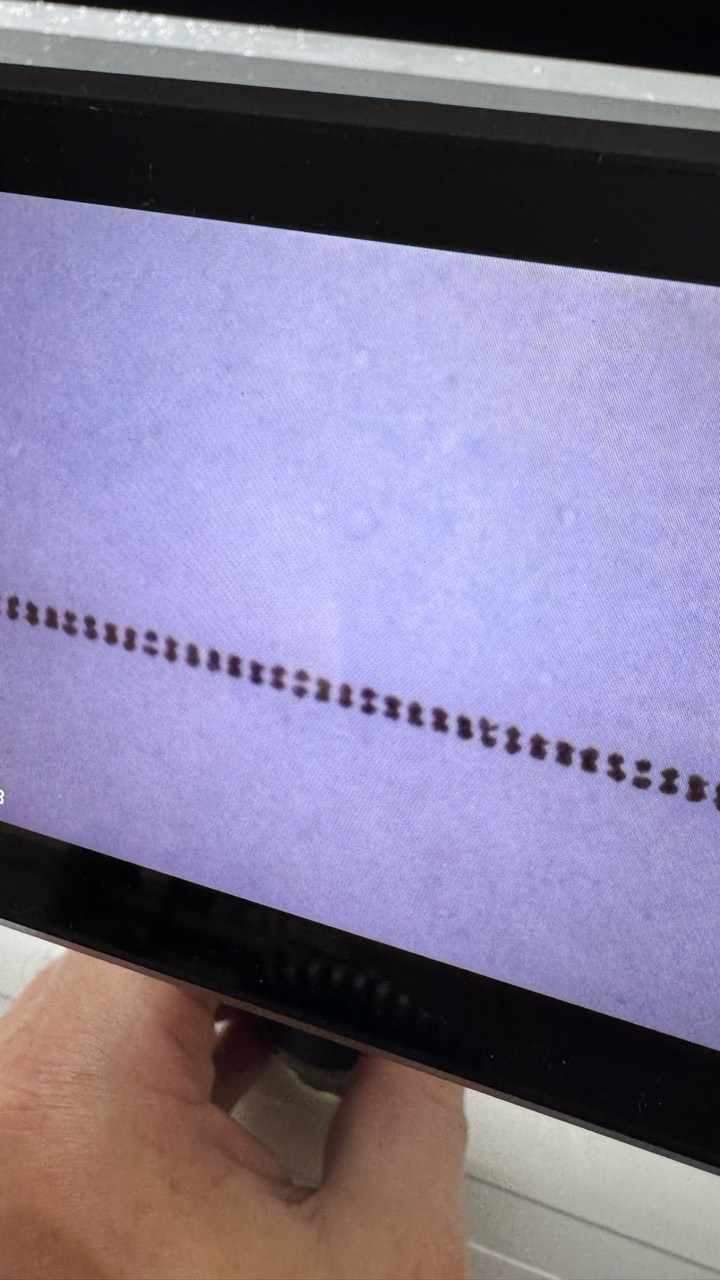
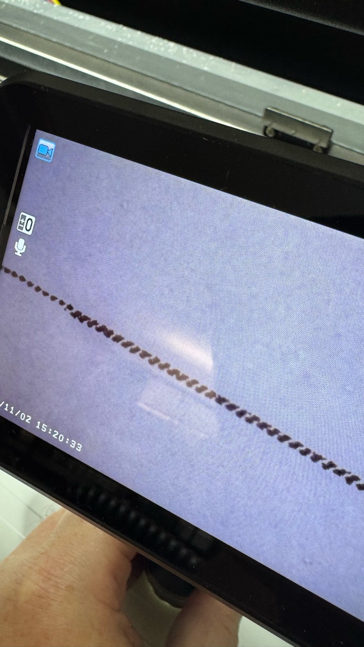
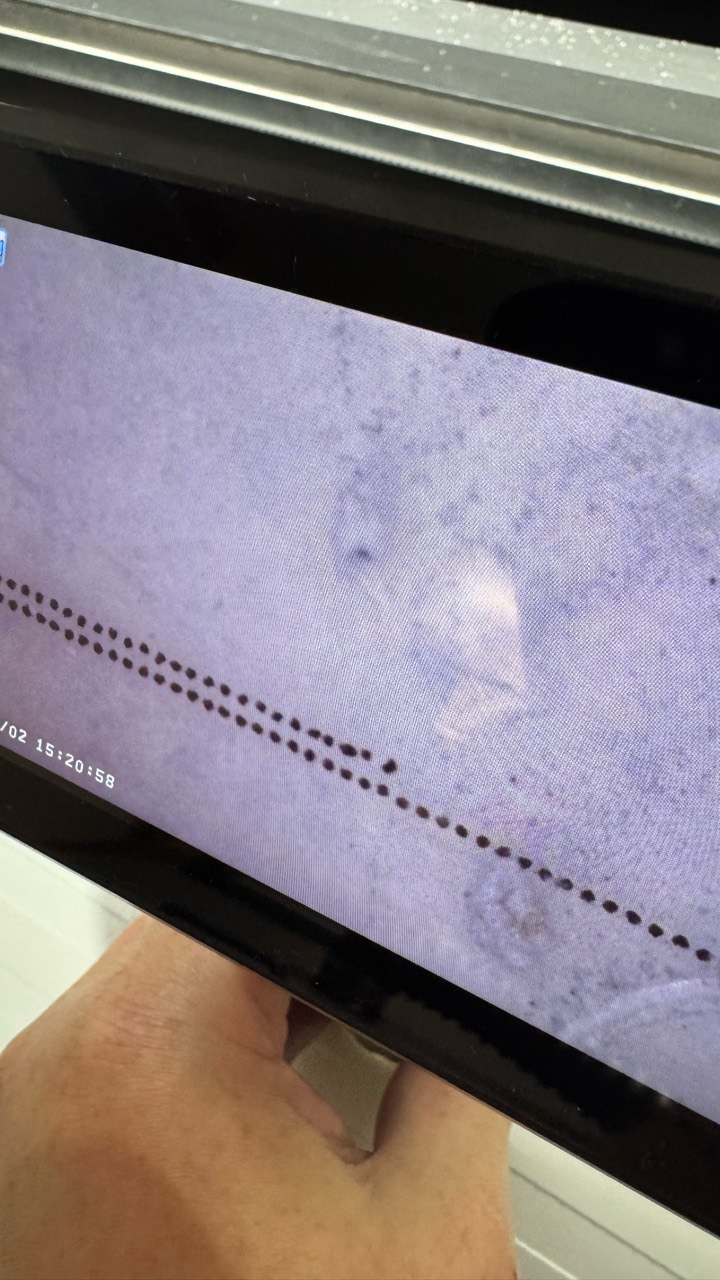
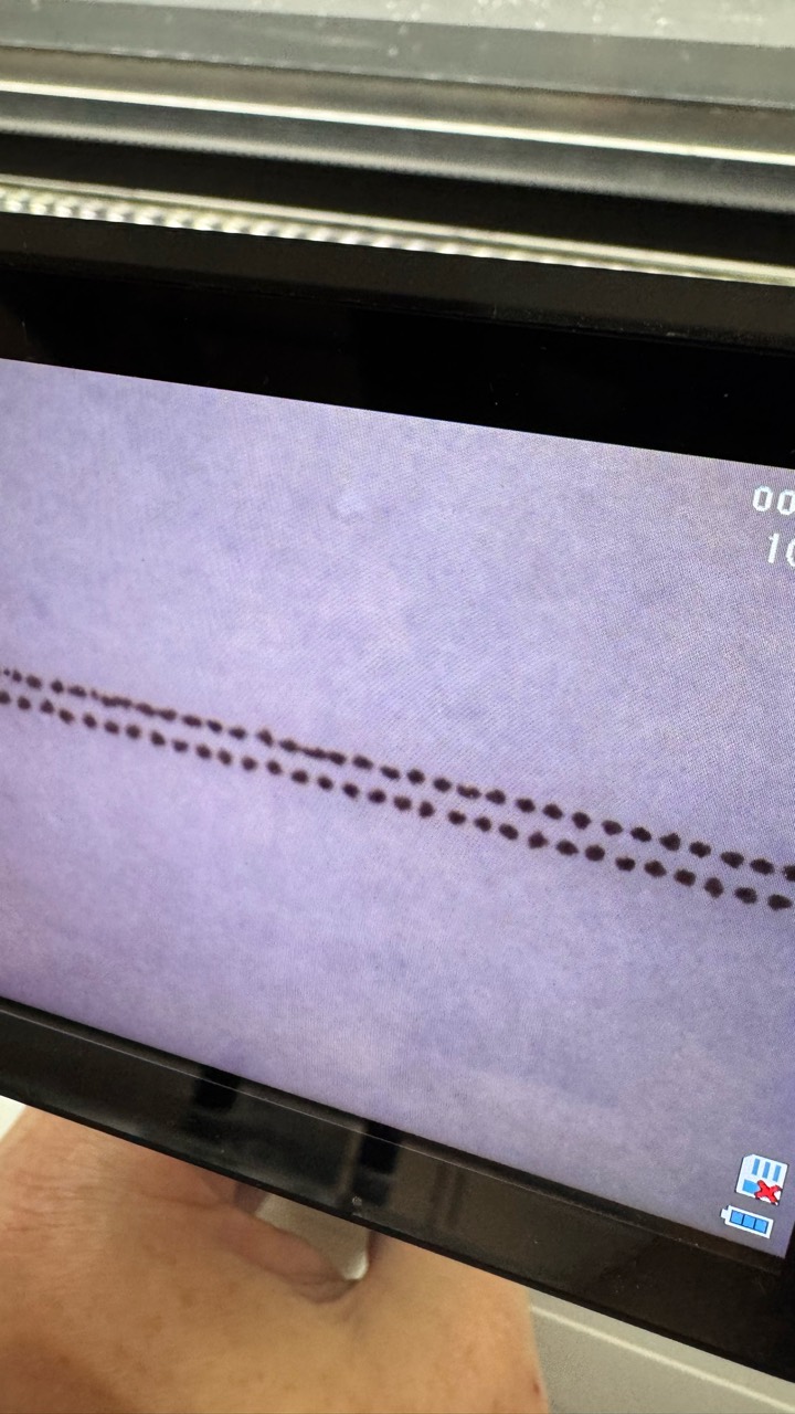
Take a look at the microscope photos. On the first pass, the dots look almost perfectly aligned. That “almost” is easy to accept as a good calibration. But the mismatch becomes more obvious over successive passes: by the sixth, the pattern has drifted apart.
When a small feed error repeats each time the film advances, it accumulates. That is why I check the whole sequence, rather than judging the first pass alone. A good match in one place does not mean the setting is accurate throughout the test.
Pass blending smooths the defect. At what cost?
A common way to hide visible joins is to raise the pass-blending setting, often called Enclosure, to 60, 80 or even 90%. The fill looks smoother, but printing slows down. A fast production printer loses its advantage if you have to keep slowing it down to get a clean result.
I prefer to reduce mechanical errors and tune the feed first, then adjust the blending. There is no reason to blame the film or ink before checking alignment. Banding alone is not a diagnosis, though: this particular test is about a calibration error.
What I’m building in NXRIP
I’m developing NXRIP’s own calibration tools to make printer setup more precise and easier to work through. One of the first is step calibration: adjusting how far the film advances between passes. It already works; I’ll keep improving the interface and usability in upcoming releases.
Ten tests in one run
Instead of changing a value and starting a new test every time, you can set up a whole series. For example, 10 variants with a step difference of 10 units, or 20 variants when you want to explore a wider range.
Print the series, inspect the results and choose the variant with the best dot alignment. If needed, test a narrower range around that value next. Fewer repeated manual steps, with results you can compare side by side.
My goal is to get smooth solid colors through accurate printer setup, rather than ever-higher blending settings. The photos below are from the current test. I’ll share more results as the calibration tools develop.